
Brand Guidelines · 2026
Make it bloom.
The Bloom brand, in one page. Colors, type, logo, imagery, voice, and the slide system — everything you need to apply it consistently.
# Bloom — Brand Guidelines

> Make it bloom.™ — the Bloom brand, in one page. Everything you need to apply it consistently.

Bloom is a performance-marketing and growth partner. Voice: confident, direct, practical — a smart partner, not a hype machine. Anchor: Ink + one accent.

---

## 01 — Color

A small, deliberate palette: a near-black anchor, three saturated accents, and a neutral gray stack. One lead accent per surface — Bloom Black (Ink) + Bloom Red (Flare) is the default pairing. Never mix accents as peers.

### Anchor & neutrals
- Bloom Black (Ink) — `#1B2126` — type, logo, photo backgrounds, dark panels. Not pure black; slightly cool.
- Bloom Light Grey (Paper) — `#EEEEEE` — primary light surface for sections, cards, statement slides.
- Bloom White — `#FFFFFF` — default background; large clean areas where type does the work.
- Bloom Grey (Ash) — `#C0C0C0` — dividers, hairline rules, borders. Structure only, never a text colour.

> Slate (#626567) is retired — grey is no longer a text colour.

### Accents — light surfaces only, used sparingly
- Bloom Red (Flare) — `#EC4C33` — primary CTA, emphasis, brand moments, accent bars. The lead accent.
- Bloom Green (Leaf) — `#3EB54A` — success, positive deltas, “bloom” moments.
- Bloom Blue (Sky) — `#2C8BCB` — links, neutral info callouts, chart series.
- Bloom Grey (Ash) — `#C0C0C0` — dividers, hairline rules, mid-neutral structure.

### Rule — accents are forbidden on Ink or black
Bloom Red, Green, and Blue are reserved for Bloom Light Grey (Paper) and White. On dark surfaces, emphasis comes from white or weight — never the accent palette. Enforced in tokens: `.bloom-dark` remaps accents to white.

### Contrast
- Bloom Black (Ink) on Bloom White — 15.3:1 — all text
- Bloom White on Bloom Black (Ink) — 15.3:1 — all text
- Bloom Black (Ink) on Bloom Light Grey (Paper) — 13.0:1 — all text
- Bloom Red (Flare) on Bloom White — 3.5:1 — large text / UI only

---

## 02 — Typography

A strong two-family pairing. Never set body in Poppins or headings in PT Serif — that inversion breaks the brand rhythm.

- Poppins — all headings, subheads, UI labels, buttons. Weights 500 / 600 / 700, occasionally 800 for display. ALL CAPS + wide tracking for subheads.
- PT Serif — all body copy. Weights 400 + 700, italics allowed. Measured, editorial counterweight.

### Scale
- Display — Poppins Bold — 64px — -0.02em
- Heading 1 — Poppins Bold — 40px
- Heading 2 — Poppins Bold — 32px
- Heading 3 — Poppins Bold — 24px
- Subhead / Eyebrow — Poppins Bold — 14px — 0em — Ink (white on dark), never an accent color
- Body Large / Lead — PT Serif Regular — 19px
- Body / Default — PT Serif Regular — 17px
- Body Small — PT Serif Regular — 15px
- Body italic — PT Serif Italic — 17px

### Typography rules
- All text is Bloom Black — never coloured, never grey.
- On a non-white or non-paper background, never use a font colour other than Bloom White.
- Eyebrow headers always use a letter-spacing of 0em.
- Eyebrows are always Poppins, never PT Serif — whether the element is a paragraph or a heading.
- PT Serif is never set in ALL CAPS — uppercase is for Poppins only.

---

## 03 — Logo

Use the white wordmark on Ink, the dark wordmark on light surfaces, and the B-monogram only where the full wordmark already appears or space is tight.

### Do
- Keep clear space around the mark equal to the height of the “b”.
- Use the white wordmark on Ink or over treated photography.
- Use the dark wordmark on white, Paper, or other light surfaces.
- Reserve the monogram for tight spaces or repeat appearances.

### Don't
- Recolor, distort, rotate, or add effects to the logo.
- Place the dark wordmark on Ink, or the white one on light.
- Set “Bloom” as plain type in place of the wordmark.
- Crowd the mark or shrink it below legibility.

---

## 04 — Imagery

Real, in-motion, human photography — never staged stock. Every photo gets Bloom's signature treatment so headlines read cleanly over it.
- Background color behind every photo: `#1B2126`.
- Photo overlay opacity: 50% (±10% for legibility).
- No gradients, patterns, or textures. Flat, typographic, editorial.

---

## 05 — Design Principles

- Spacing — 4pt grid (4 / 8 / 12 / 16 / 24 / 32 / 48 / 64 / 96). Marketing layouts breathe.
- Corners — modest: 2 / 4 / 6 / 10px, plus pill for tags. Large radii (16px+) are off-brand.
- Shadows — soft, neutral, Ink-tinted (not black). Light border or shadow, never both.
- Motion — 140–400ms, standard ease in, ease-out. Fade + small translate (≤8px). No bounces.
- Buttons — solid (Flare or Ink) or outline (2px Ink). 4px radius max — never pill-shaped buttons.
- Layout — sticky nav, content caps at 760 / 1040 / 1280 / 1440px. 12-col grid, left-aligned.

---

## 06 — Voice & Tone

Confident, direct, practical. “Make it bloom” is about results, not gardening — avoid flower puns. Evidence over enthusiasm.

### Core traits
- Confident, not boastful — states results plainly and lets evidence carry the weight. Claims are backed by real numbers and account experience (“tested across a dozen accounts” beats any superlative). Prove it; don't sell it.
- Direct & practical — short, active sentences in sentence case with a hard period (“Accelerating growth.”). Plain words beat jargon; name what something is, don't dress it up. No fluff, no buzzwords.
- Challenger mindset — pushes to challenge the status quo and outperform the goal. Ambitious and growth-minded on the client's behalf; questions the default and backs a sharper way forward.
- Grounded & editorial — restrained in look and tone. Energy comes from typographic weight and contrast, never effects or theatrics. Reads like a sharp colleague, not a press release, and is secure enough to say when something missed. Modest, deliberate, mature.

### Do
- “We help you scale what works.”
- “Testing, learning, iteration — every week.”
- Sentence-case headlines with a hard period. Active voice, short sentences.

### Don't
- “We sprinkle growth magic.” / “Guaranteed viral results.”
- Hype, exclamation marks, or emoji in decks and on the website.
- Avoid: petals, sprinkle, blossom magic, game-changing, synergy, unlock potential, secret sauce.

---

## 07 — Slides

Before building a deck, decide the track. If it ends in an ask for money or a signature, it's Sales; if it ends in “here's where we are,” it's Internal.

### Track A — Sales (win the business)
Audience: a prospect deciding whether to hire Bloom.
- Tier System + Bloom Storyline + the pitch chassis.
- Full polish — it's a first impression.
- Capability decks, pitches, proposals, RFP responses.

### Track B — Internal (inform & align)
Audience: a client we already serve, or our own team.
- Two simple recipes + lighter reporting layouts.
- Fewer rules, faster to fill — still on brand.
- Client reports, status updates, QBRs, team decks.

### Quality gate — “What's Not Bloom”
Both tracks must pass before leaving the building: no gradients, no Inter, no emoji, no pill or tinted cards, no accent color on dark, no heavy horizontal divider rules, left-aligned, real photography. If a slide trips the five-second sniff test, it isn't on brand yet.

---

## 08 — Data Table

One table style for reports, scorecards, and decks. Figures carry the weight.
- Header — Bloom Black fill, Bloom White text, Roboto SemiBold uppercase.
- Figures — Roboto, tabular. Row labels and totals share the same face.
- Structure — 1px Bloom Black border, hairline row rules, 10/20 cell padding, Paper total row.
- Change — numbers stay Bloom Black; colour appears only in the ▲ (up) / ▼ (down) / — (flat) marker.

---

## 09 — Grid

One grid pattern for capability spreads, channel breakdowns, and comparison layouts. Boxes share a 20px gutter and a 1px Bloom Black border; the content body is white.
- Columns — 2, 3, or 4 across, all on the 20px Bloom-standard gutter.
- Header cycle — Bloom Black → Bloom Red (Flare) → Paper, applied automatically when a component has more than one box. A single grid uses the Bloom Black header.
- One accent — Flare appears once per cycle, so even a 4-box grid never shows more than one accent header. Text is Bloom White on Ink/Flare, Bloom Black on Paper.

---

Bloom Brand Guidelines · 2026 · Confidential — internal & partner use · Make it bloom.™
Brand Guidelines · 2026
The Bloom brand, in one page. Colors, type, logo, imagery, voice, and the slide system — everything you need to apply it consistently.
01 — Color
A near-black anchor, a light neutral stack, and three saturated accents. One lead accent per surface — Bloom Black + Bloom Red is the default pairing. Never mix accents as peers.
Flare, Leaf, and Sky are reserved for Paper and White. On dark surfaces, emphasis comes from Bloom White or weight — never the accent palette. The reds, greens, and blues turn muddy on Ink and break the hierarchy. (This rule is enforced in the tokens: .bloom-dark remaps accents to white.)
| Foreground | Background | Ratio | Use |
|---|---|---|---|
| Bloom Black (Ink) | Bloom White | 15.3 : 1 | ✓ All text |
| Bloom White | Bloom Black (Ink) | 15.3 : 1 | ✓ All text |
| Bloom Black (Ink) | Bloom Light Grey (Paper) | 13.0 : 1 | ✓ All text |
| Bloom Red (Flare) | Bloom White | 3.5 : 1 | Large text / UI only |
02 — Typography
A strong two-family pairing. Never set body in Poppins or headings in PT Serif — that inversion breaks the brand rhythm.
All text is Bloom Black — never coloured, never grey.
On a non-white or non-paper background, never use a font colour other than Bloom White.
Eyebrow headers always use a letter-spacing of 0em.
Eyebrows are always Poppins, never PT Serif — whether the element is a paragraph or a heading.
PT Serif is never set in ALL CAPS — uppercase is for Poppins only.
03 — Logo
Use the white wordmark on Ink, the dark wordmark on light surfaces, and the B-monogram only where the full wordmark already appears or space is tight.

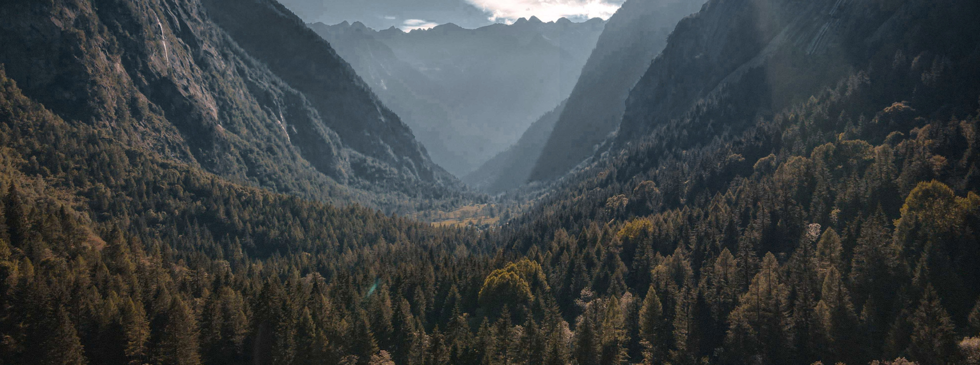
04 — Imagery
Real, in-motion, human photography — never staged stock. Every photo gets Bloom's signature treatment so headlines read cleanly over it.


05 — Design Principles
The system favors restraint. Energy comes from typographic weight and contrast, not effects.
A 4pt grid — 4 / 8 / 12 / 16 / 24 / 32 / 48 / 64 / 96. Marketing layouts breathe; favor large vertical rhythm between sections.
Intentionally modest — 2 / 4 / 6 / 10px, plus pill for tags. Large radii (16px+) are off-brand. Cards default to 6px.
Soft, neutral, Ink-tinted — not black. Four-step elevation. Light border or shadow, never both. No inner shadows.
140–400ms, standard ease in, ease-out. Fade + small translate (≤8px). No bounces, springs, or playful wiggle.
Solid (Flare or Ink, white label) or outline (2px Ink). 4px radius max — never pill-shaped buttons. Generous horizontal padding.
Sticky nav with backdrop blur; content caps at 760 / 1040 / 1280 / 1440px. 12-col grid, generous side gutters. Left-aligned.
06 — Voice & Tone
Confident, direct, practical. "Make it bloom" is about results, not gardening — avoid the flower puns. Evidence over enthusiasm.
Bloom states results plainly and lets the evidence carry the weight. Claims are backed by real numbers and account experience — "tested across a dozen accounts" says more than any superlative. Prove it; don't sell it.
Short, active sentences in sentence case with a hard period ("Accelerating growth."). Plain words beat jargon every time — name what something is, don't dress it up. No fluff, no buzzwords.
The brand pushes to challenge the status quo and outperform the goal. Ambitious and growth-minded on the client's behalf, it questions the default and backs a sharper way forward.
Restrained in look and in tone. Energy comes from typographic weight and contrast, never effects or theatrics. It reads like a sharp colleague, not a press release — and is secure enough to say when something missed. Modest, deliberate, mature.
"We help you scale what works."
"Testing, learning, iteration — every week."
Sentence case headlines with a hard period. Active voice, short sentences.
"We sprinkle growth magic."
"Guaranteed viral results."
Hype, exclamation marks, or emoji in decks and on the website.
07 — Slides
Before building a deck, decide the track. If it ends in an ask for money or a signature, it's Sales; if it ends in "here's where we are," it's Internal.
Audience: a prospect deciding whether to hire Bloom.
Audience: a client we already serve, or our own team.
Both tracks must pass before leaving the building: no gradients, no Inter, no emoji, no pill or tinted cards, no accent color on dark, no heavy horizontal divider rules, left-aligned, real photography. If a slide trips the five-second sniff test, it isn't on brand yet — no matter how clean it looks.
08 — Data Table
One table style for reports, scorecards, and decks. Figures carry the weight — a Bloom Black header, Roboto throughout, and colour only where a number changed.
| Channel | Sessions | Conv. Rate | Revenue | MoM |
|---|---|---|---|---|
| Paid Search | 48,210 | 3.8% | $182,400 | ▲12% |
| Paid Social | 31,940 | 2.6% | $96,750 | ▲7% |
| Organic | 52,880 | 4.1% | $144,200 | ▲18% |
| 18,330 | 6.2% | $88,600 | ▼3% | |
| Referral | 9,410 | 3.3% | $27,050 | ▬0% |
| Total | 160,770 | 4.0% | $539,000 | ▲9% |
09 — Grid
One grid pattern for capability spreads, channel breakdowns, and comparison layouts. Boxes share a 20px gutter and a 1px Bloom Black border; headers cycle Bloom Black → Bloom Red → Paper, so even a four-up never shows more than one accent.
Capture demand the instant it surfaces, then compound what converts.
Build audiences and creative that move people from scroll to consideration.
Set the plan against the goal, not the channel.
Test, learn, and scale what the data backs.
Measure cleanly so every claim has a number behind it.
Capture demand as it surfaces.
Create demand with sharp creative.
Extend reach efficiently.
Grow value after the first sale.